
What The School TVs Actually Say
These are examples of how NOT to design an ad! If the school TVs have given students of Wyoming anything, it’s how not to create ads. The overload of information, lack of readability and unpleasing designs is damaging to one’s eyes. No wonder students don’t pay attention to them!
We rated the overall slideshow in four categories: content, visuals, readability and entertainment. The perfect slide should fit the TV, be informative, be aesthetically pleasing and readable. Slides should also not have an overload of information or be strenuous to read.
The slideshow failed in all of these categories! Though the slides did exhibit relevant content such as job, club, school and FAFSA postings, most slides were either overloaded with information or lacked any.
The Tesa slide was overloaded with information. Limited space was left for visuals and the amount of information made the slide unreadable. The slide was structured like a brochure, not an ad. No student is going to read an essay’s worth of information on any TV ad.
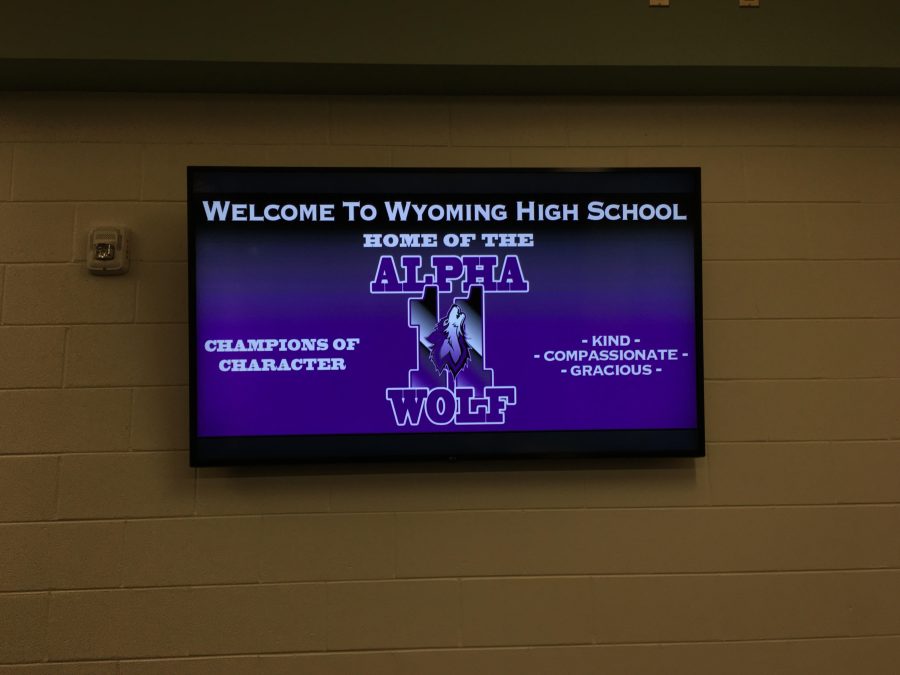
Another issue with the slides was the repetitiveness. Though Alpha Wolf is an important part of our school, it is unnecessary to have multiple slides repeating the same information in different wording. One slide for expectations and one for the tickets are sufficient enough.
When it comes to the visuals, the French slides are some of the worst offenders of bad design. The first one, at a glance, isn’t the worst; the second one, however, is horrendous. The font on its own is a nice one; a little hard on some eyes, but overall it works. Yet when it’s put against the most saturated red text you can possibly get it’s absolutely unreadable.
Out of all the slides, the FAFSA slides seemed to have the best display. The overall appearance was neat and fit together, using complimentary colors with the blues, greens and pink flamingos. The information on the two slides was simple and straight to the point without any excess wording.
Many of the slides have gone unnoticed, and for the most part it makes sense. The unreadable text, blocks of paragraphs, and unappealing visuals and colors make for an overall unappealing design to students. Maybe in the future there will be more appealing slides to look at.